
Other versions of the Mr. Kite poster
I'm not the first person to recreate this poster. In the film that was made about my quest to remake it I mention that one of the reasons I embarked on the project was because I was dissatisfied with what was already out there. Unfortunately, plenty of people continue to confuse these other copies with the original...
This weekend I was looking through Mojo magazine's special Beatles supplement and they included a photo of one of these copies in the magazine and labelled it incorrectly as the original. So I thought I would write a quick guide here to spotting the difference between these copies and the original.
It's actually rather easy once you take a good look. There are just three things to notice and two of them are really easy to spot even for those who aren't fussy typographers...
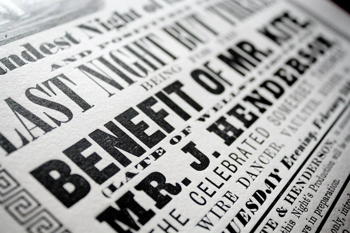
1. The narrow 'F'
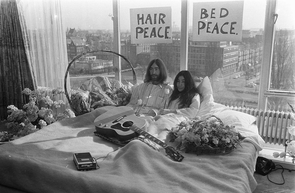
In the film (embedded below) look at the line "BENEFIT OF MR. KITE," on the poster that John Lennon is standing next to. You'll notice that the capital F is noticeably narrower than the other letters in that line. This is quite likely to have been done just to make that line of type fit the width of the poster. Just as few people notice it now, no-one would really have cared back then either.
Remember that this was just an ephemeral poster – there was nothing inherently special about it at the time. It would have been printed quickly and without too much care or attention to detail.
2. The printed border
The border is a Greek key pattern. On the original poster it forms a continuous frame. On some of the other copies you'll notice that gaps have been left in the corners.
3. The typeface used for the "Mr. Kite" line
Take another look at the line "BENEFIT OF MR. KITE,". The other copies of this poster all use one of two typefaces for this – Futura or Helvetica. These are both very well known twentieth century typefaces. Futura was designed in the 1920s and 1930s and Helvetica was developed in 1957. Obviously it's impossible that either of those those would have been used on the original in 1843.
So here are those other copies. I'm particularly amused by the one apparently covered in coffee-ring stains. It's actually just an 'aged' version of the one next to it.

The original can be seen in the short film by Nick Esdaile and Joe Fellows:
Also in News

Last posting dates for Christmas 2025
Order your prints in good time to arrive before Christmas. In this post, we'll suggest the latest times you should order for delivery in the UK, US and beyond.
Celebrating John Lennon’s legacy on his birthday
October 9, 1940 is an important date in Beatles’ history – the day John Lennon was born. Each year, fans across the world celebrate his life and legacy. As one of the most well-known cultural icons of all time, Lennon’s impact on the world was undeniable, as both a musical icon and an advocate for peace.
Sgt. Pepper was released 58 years ago today!
Today marks a special anniversary for Beatles’ fans – especially for us here at Kite! On the 26th May 1967, the Beatles released Sgt. Pepper's Lonely Hearts Club Band.

Sign up to our (infrequent) newsletter and you’ll be automatically entered into a prize draw to win your choice of any print available on this site! You’ll also be first to hear about new limited edition prints and special offers.
Join today